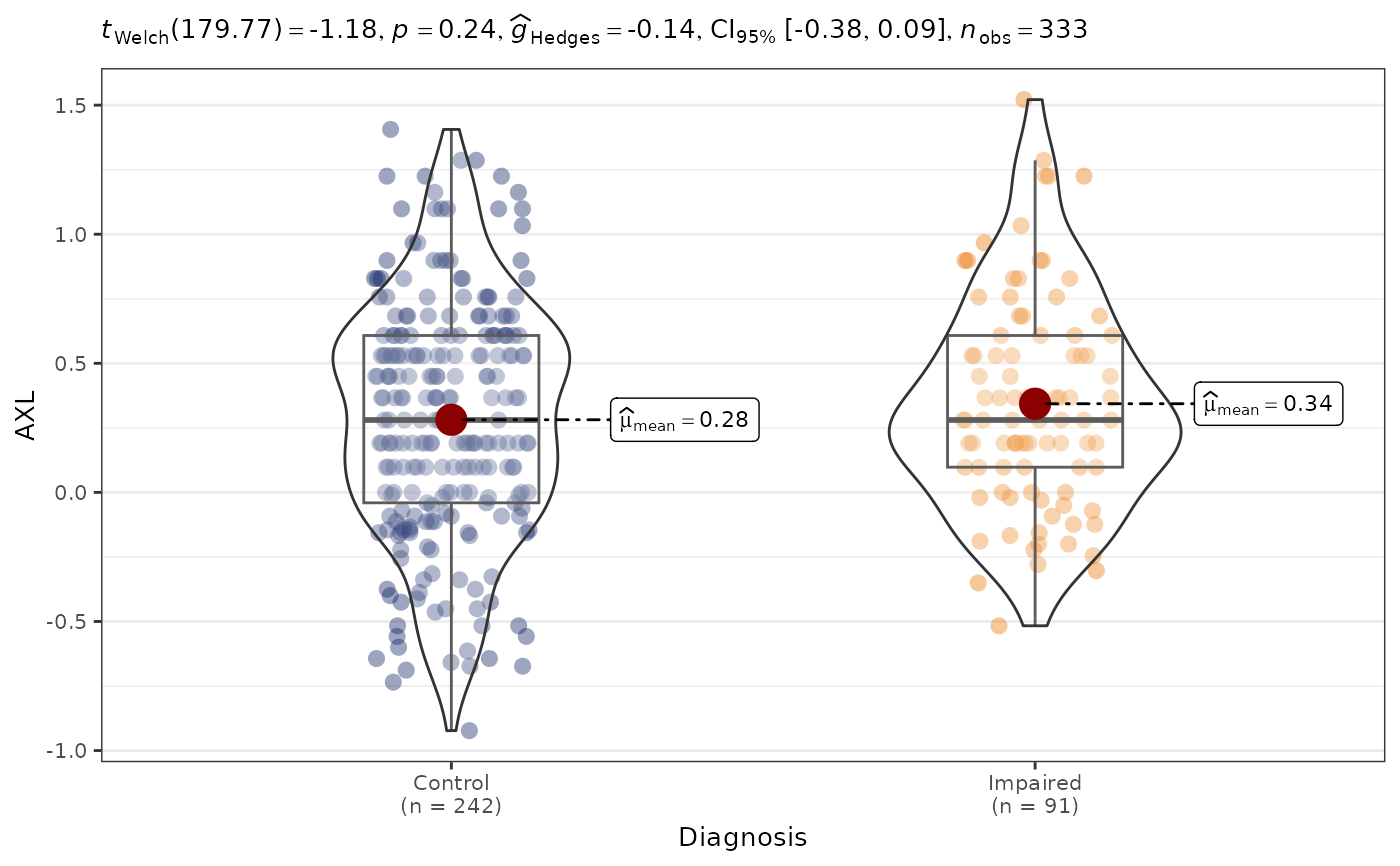
This function generates scatter plots or box plots to visualize the relationship between two variables.
Usage
PlotAssociations(
  data,
  Var1,
  Var2,
  Ordinal = FALSE,
  IncludeTrendSymbol = FALSE,
  DataFrame = lifecycle::deprecated()
)
Arguments
- data
The data frame containing the variables of interest.
- Var1
The name of the first variable.
- Var2
The name of the second variable.
- Ordinal
Logical, indicating whether ordinal variables should be included.
- IncludeTrendSymbol
Logical; append a plus sign to a nominal-trend subtitle.
- DataFrame
Deprecated (since 19.15.0). Use
datainstead.
References
This function wraps ggstatsplot. Please cite:
Patil, I. (2021). Visualizations with statistical details: The 'ggstatsplot' approach. Journal of Open Source Software, 6(61), 3167. doi:10.21105/joss.03167
Examples
data(SampleData)
data(SampleVariableTypes)
Labelled <- RevalueData(SampleData, SampleVariableTypes)$RevaluedData
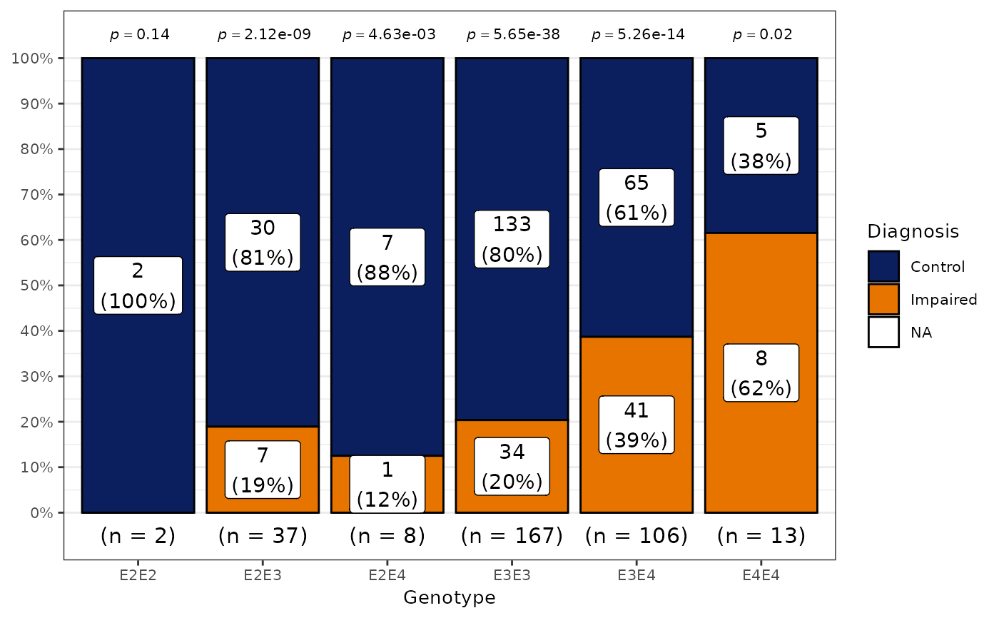
# Two categorical variables (grouped bar chart)
PlotAssociations(Labelled, "Diagnosis", "Genotype")
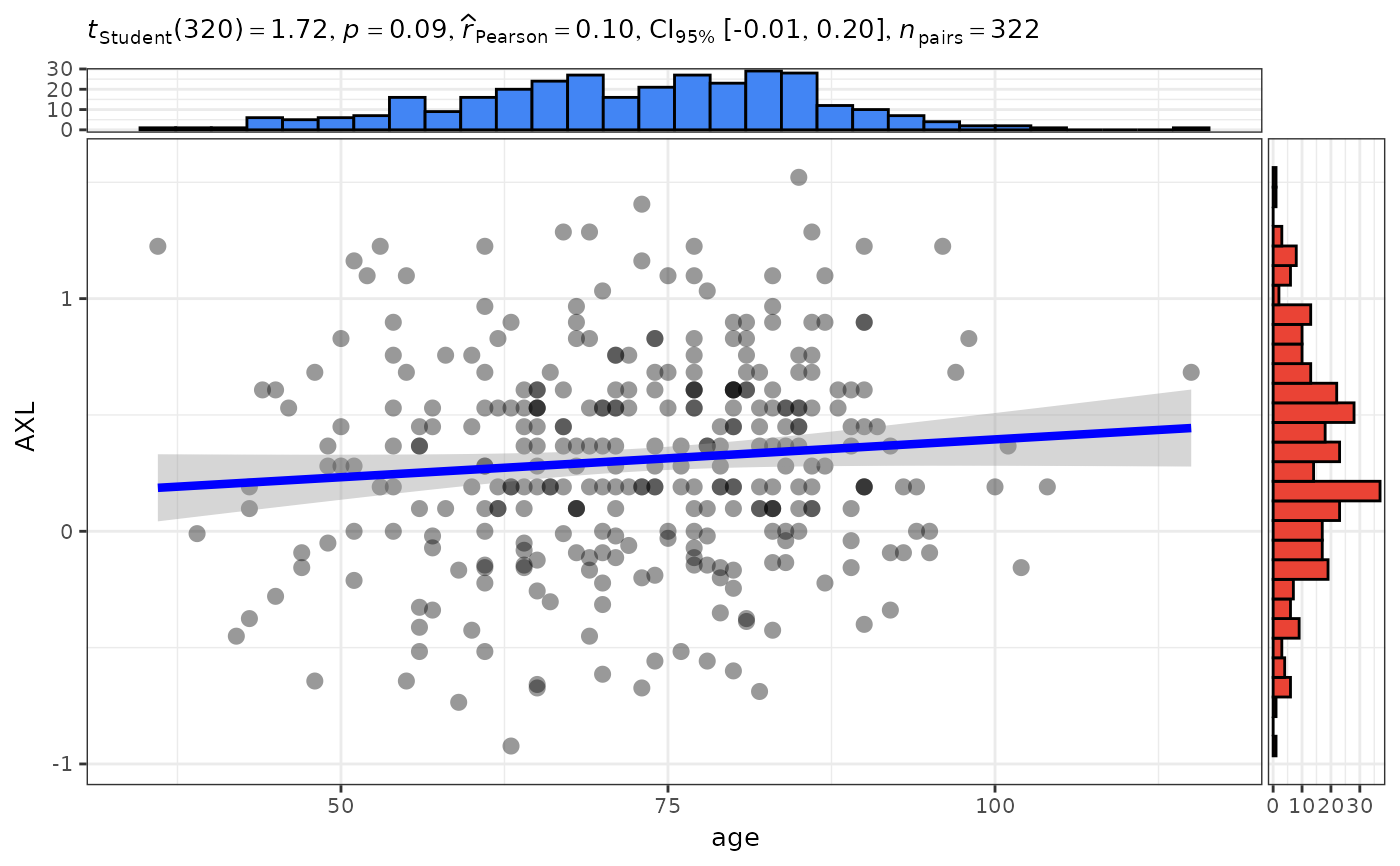
 # Two continuous variables (scatter plot with correlation)
PlotAssociations(Labelled, "age", "AXL")
# Two continuous variables (scatter plot with correlation)
PlotAssociations(Labelled, "age", "AXL")
 # One continuous and one categorical variable (box/violin plot)
PlotAssociations(Labelled, "Diagnosis", "AXL")
# One continuous and one categorical variable (box/violin plot)
PlotAssociations(Labelled, "Diagnosis", "AXL")