
Generates a Bland-Altman plot to visualize the agreement between two variables.
Usage
PlotBlandAltman(
  data,
  Variable1,
  Variable2,
  DataFrame = lifecycle::deprecated()
)Value
A list containing:
- plot
A ggplot2 object of the Bland-Altman plot.
- stats
A list of Bland-Altman statistics from the BlandAltmanLeh package.
Details
Use this when two methods measure the same quantity in the same units and the question is whether one can be substituted for the other: a new assay against an established one, a wearable against a clinical monitor, an automated segmentation against a manual trace, or the same rater twice.
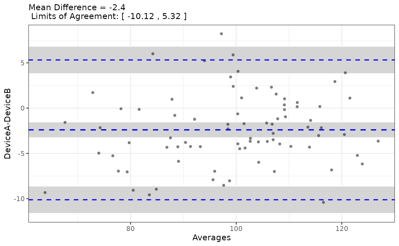
The plot draws the difference between the two measurements against their mean, one point per subject, with three horizontal reference lines: the mean difference (the bias, or systematic offset between the methods) and the 95% limits of agreement, at bias +/- 1.96 SD of the differences. Those limits are the useful output. They say that for about 95% of subjects, the two methods differ by no more than that much - and whether that is acceptable is a clinical judgment, not a statistical one, made by comparing the interval against the difference that would change a decision.
Why not correlation
Bland and Altman introduced this plot specifically because correlation
coefficients are the wrong tool for method comparison, and it remains the
most common mistake in agreement studies. A high r only means the two
measurements move together, which they must, since both track the same
underlying quantity. It is unchanged if one method reads systematically
twice as high, or ten units too high, in every subject - the points still
fall on a straight line. Correlation also inflates as the range of measured
values widens, so the same pair of methods can look better simply by
recruiting a more heterogeneous sample. Agreement asks whether the actual
numbers match, which is what substituting one method for another requires.
What the example shows
The worked example builds two devices that measure the same underlying quantity, one carrying a small constant offset. The reported bias recovers that offset (its sign depends on which measurement is subtracted from which), and the limits of agreement say how far apart the two devices can be expected to fall for an individual sample.
Their correlation is near-perfect, and would be just as high if the offset were 200 units instead of 2 - which is precisely why agreement is assessed this way rather than with a correlation coefficient.
The third device has essentially no bias but poor precision. Its correlation with the first is still respectable, yet its limits of agreement are roughly three times wider: on any individual sample the two may differ by more than 20 units. That is the failure this plot exposes and a summary coefficient does not.
Reading the plot
Bias far from zero - one method reads consistently high or low. A constant offset can often be corrected by recalibration.
Wide limits of agreement - the methods disagree unpredictably in individual subjects, even if the bias is near zero. This is the failure that a correlation coefficient hides.
A funnel shape, spread growing with the mean - the disagreement is proportional rather than constant, and the analysis is usually redone on log-transformed values or reported as percentage differences.
A slope in the cloud - the bias depends on the magnitude being measured, so a single bias figure does not describe the methods.
Both measurements must be on the same scale for any of this to be meaningful. Two different quantities, or the same quantity in different units, produce a plot that renders but means nothing.
References
Bland JM, Altman DG. Statistical methods for assessing agreement between two methods of clinical measurement. The Lancet. 1986;327(8476):307-310.
Bland JM, Altman DG. Measuring agreement in method comparison studies. Statistical Methods in Medical Research. 1999;8(2):135-160.
Examples
# Two devices measuring the same quantity; device B carries a 2-unit bias
set.seed(101)
n <- 80
truth <- rnorm(n, mean = 100, sd = 15)
method_data <- data.frame(
SampleID = paste0("S", 1:n),
DeviceA = truth + rnorm(n, 0, 3),
DeviceB = truth + 2 + rnorm(n, 0, 3)
)
result <- PlotBlandAltman(method_data, "DeviceA", "DeviceB")
# Agreement plot: mean difference (bias) and 95% limits of agreement
result$plot
 # Bias and limits of agreement
result$stats$mean.diffs
#> [1] -2.400073
result$stats$lines
#> lower.limit mean.diffs upper.limit
#> -10.119574 -2.400073 5.319428
# Correlation for the same pair, which the offset does not affect
cor(method_data$DeviceA, method_data$DeviceB)
#> [1] 0.9636358
# A device with no bias but poor precision
method_data$DeviceC <- truth + rnorm(n, 0, 12)
noisy <- PlotBlandAltman(method_data, "DeviceA", "DeviceC")
noisy$plot
# Bias and limits of agreement
result$stats$mean.diffs
#> [1] -2.400073
result$stats$lines
#> lower.limit mean.diffs upper.limit
#> -10.119574 -2.400073 5.319428
# Correlation for the same pair, which the offset does not affect
cor(method_data$DeviceA, method_data$DeviceB)
#> [1] 0.9636358
# A device with no bias but poor precision
method_data$DeviceC <- truth + rnorm(n, 0, 12)
noisy <- PlotBlandAltman(method_data, "DeviceA", "DeviceC")
noisy$plot
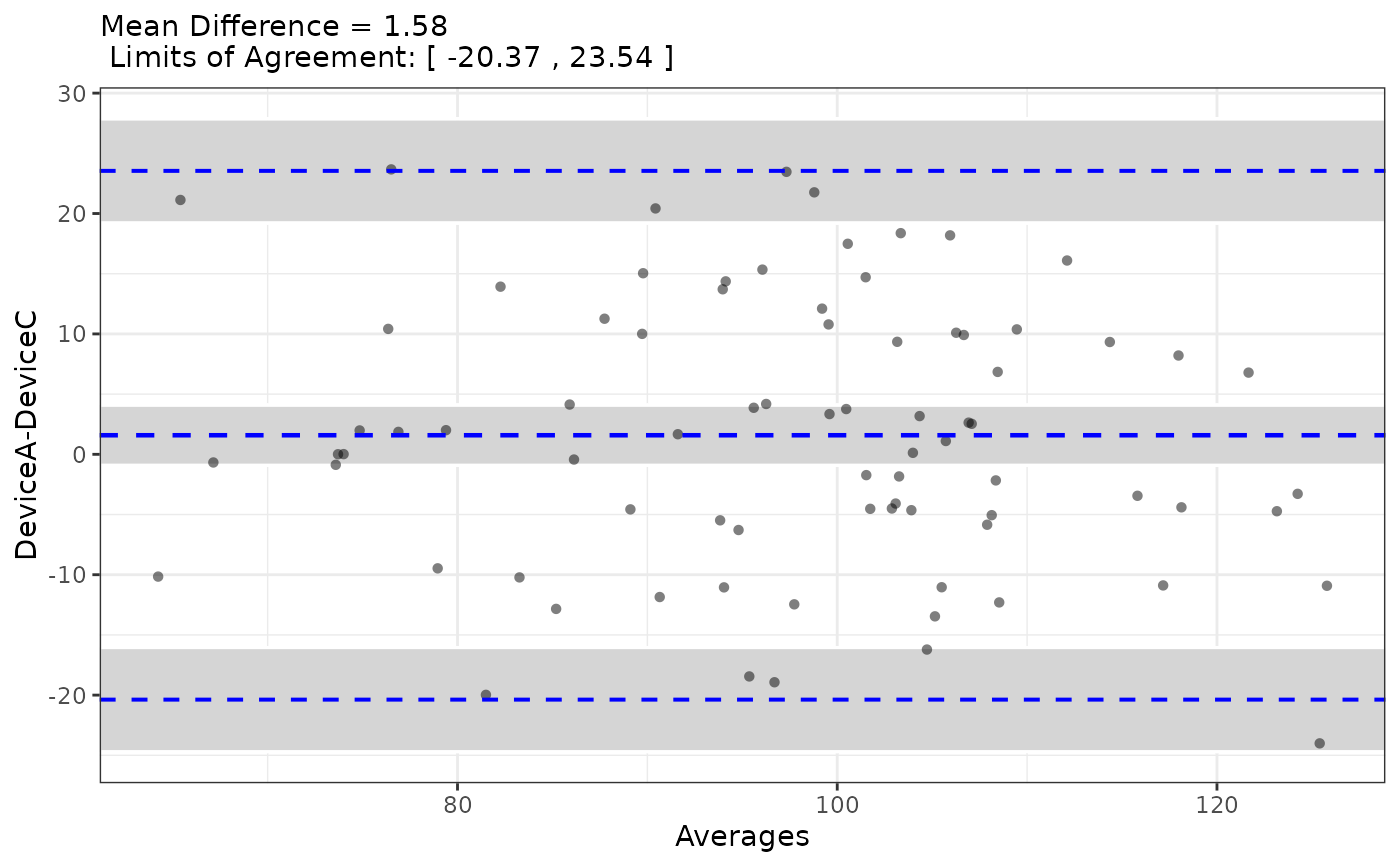 noisy$stats$mean.diffs
#> [1] 1.583964
noisy$stats$lines
#> lower.limit mean.diffs upper.limit
#> -20.374642 1.583964 23.542571
cor(method_data$DeviceA, method_data$DeviceC)
#> [1] 0.7368161
noisy$stats$mean.diffs
#> [1] 1.583964
noisy$stats$lines
#> lower.limit mean.diffs upper.limit
#> -20.374642 1.583964 23.542571
cor(method_data$DeviceA, method_data$DeviceC)
#> [1] 0.7368161