
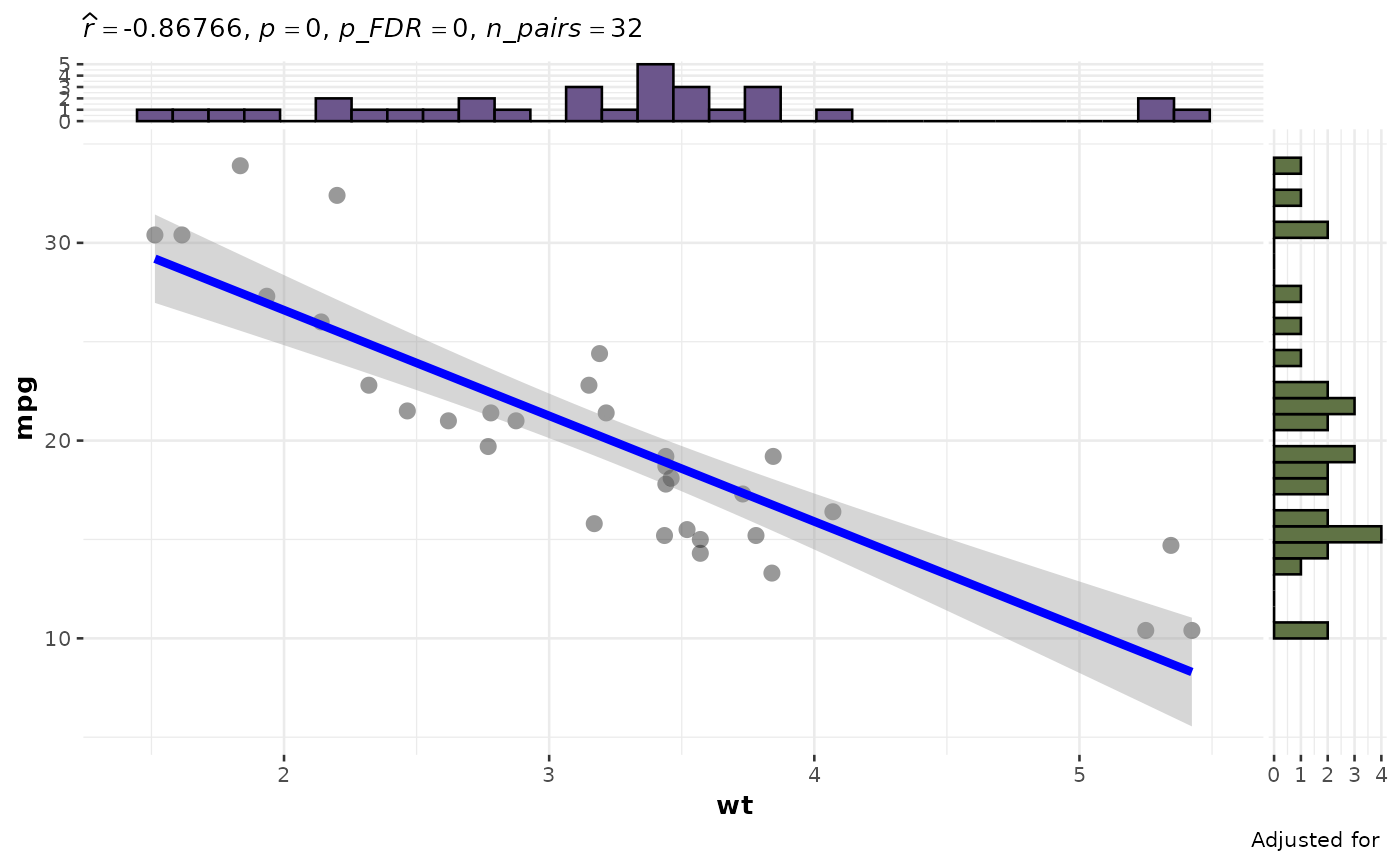
Generate scatterplots for significant correlations based on a previously generated correlation heatmap.
Usage
plotSigCorrelations(
  data,
  CorrelationHeatmapObject,
  PVar = "P",
  Pthresh = 0.05,
  DataFrame = lifecycle::deprecated()
)
Arguments
- data
The dataset used to generate the scatterplots.
- CorrelationHeatmapObject
The output of the PlotCorrelationsHeatmap function.
- PVar
The name of the column used to filter for significance (default is "P").
- Pthresh
The significance threshold (default is 0.05).
- DataFrame
Deprecated (since 19.15.0). Use
datainstead.
Examples
# \donttest{
# Build a correlation heatmap, then plot the significant pairs. Keep the
# predictor and outcome sets disjoint so no variable is correlated with
# itself.
ch <- PlotCorrelationsHeatmap(
mtcars,
predictor_vars = c("wt", "hp", "disp"),
outcome_vars = c("mpg", "qsec")
)
plots <- plotSigCorrelations(mtcars, ch)
# Display the first significant-correlation scatterplot
plots[[1]]
 # }
# }