
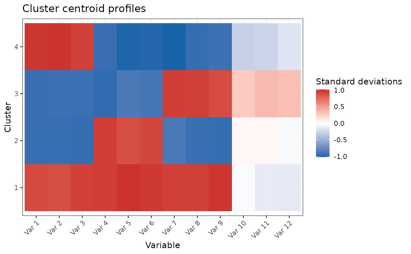
Cluster centres across clustering variables. Values are the centres in the frozen analysis scale, so a centred and scaled model reads directly as standard deviations from the cohort mean.
PlotClusterCentreProfile() shows the same centres as connected
lines, which reads more like the SOM line map when variables have a
meaningful order.
Usage
PlotClusterCentreHeatmap(
  centers,
  variable_labels = NULL,
  title = "Cluster centre profiles",
  value_label = "Centre",
  cluster_rows = FALSE,
  cluster_columns = FALSE
)

PlotClusterCentreProfile(
  centers,
  variable_labels = NULL,
  title = "Cluster centre profiles",
  value_label = "Centre"
)Examples
# \donttest{
data(SimulatedPhenotypeData)
df_Training <- dplyr::filter(SimulatedPhenotypeData, .data$Cohort == "Training")
model <- CreateClusterModel_KMeans(
df_Training, paste0("Var", 1:12), method = "finalize", final_k = 4
)
model$ModelInfo$plots$centre_heatmap
 # }
# }