
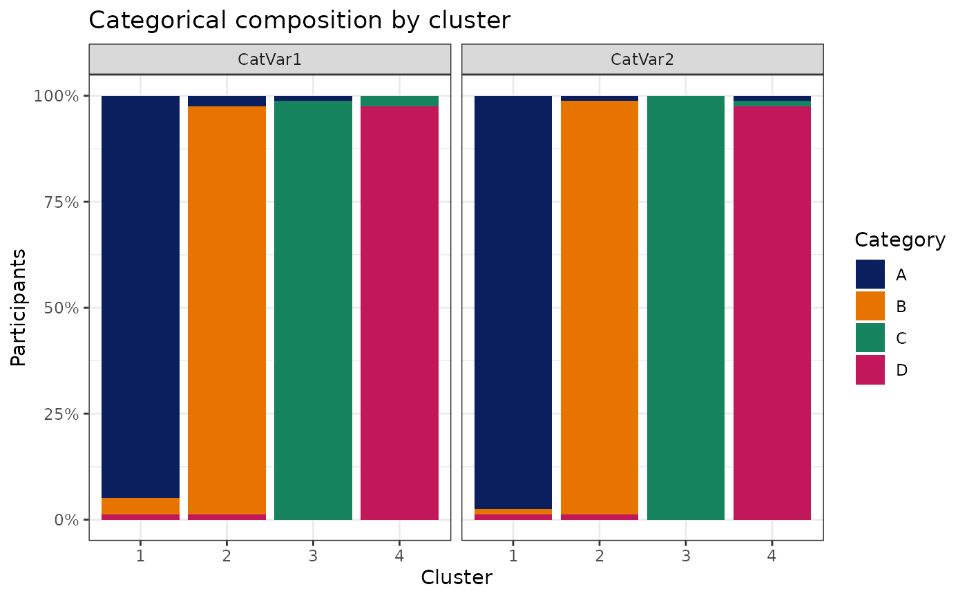
Plot categorical composition by cluster
Arguments
- data
Data frame containing the categorical variables.
- variables
Categorical variable names.
- cluster
Cluster assignment vector aligned to
data.- facet_by
Whether stacked-bar facets represent categorical variables (the default) or clusters.
- style
Either
"stacked"for composition bars or"enrichment"for a cluster-first heatmap of percentage-point differences from the cohort.
Examples
# \donttest{
data(SimulatedPhenotypeData)
df_Training <- dplyr::filter(SimulatedPhenotypeData, .data$Cohort == "Training")
model <- CreateClusterModel_Gower_PAM(
df_Training, c("Var1", "Var2", "CatVar1", "CatVar2"),
method = "finalize", final_k = 4
)
model$ModelInfo$plots$categorical_composition
 # }
# }