
Plot labelled numeric profiles by cluster
Examples
# \donttest{
data(SimulatedPhenotypeData)
df_Training <- dplyr::filter(SimulatedPhenotypeData, .data$Cohort == "Training")
model <- CreateClusterModel_KMeans(
df_Training, paste0("Var", 1:12), method = "finalize", final_k = 4
)
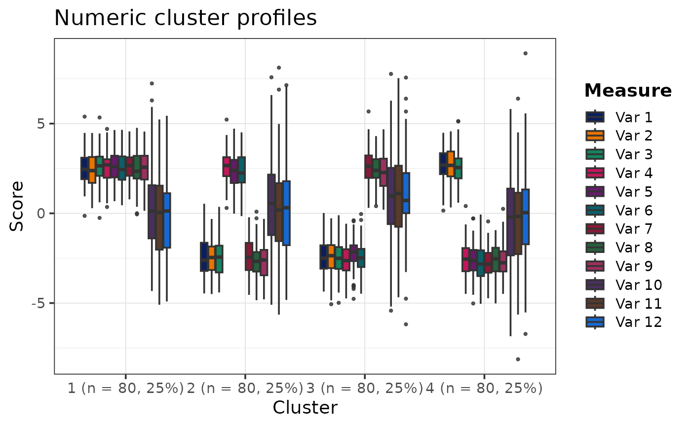
PlotClusterProfiles(model$DataWithClusters, "Cluster", paste0("Var", 1:12))
 # }
# }